Rules of Thumb
- Application State (when present) should be visible at all times. Developers should configure menu placements to ensure the app state is not occluded.
- Use short names for application states when possible to reduce crowding in the Global Status Bar.
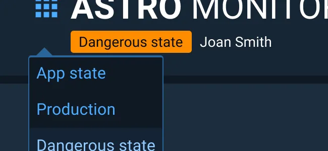
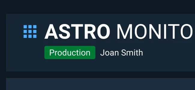
- Make an explicit decision on whether labeling the live/production version of the application is appropriate for your application. Depending on the use case, this additional indicator can be helpful or distracting and unnecessary.
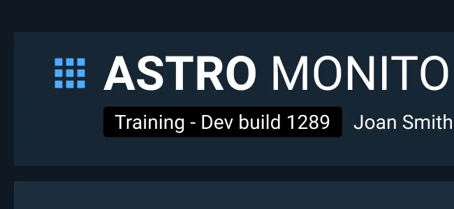
- If the application is in more than one state at a time, for example a training state that is still being created in the development environment, then show all relevant state names within the same App State component, but with a textual divider such as a slash or comma.
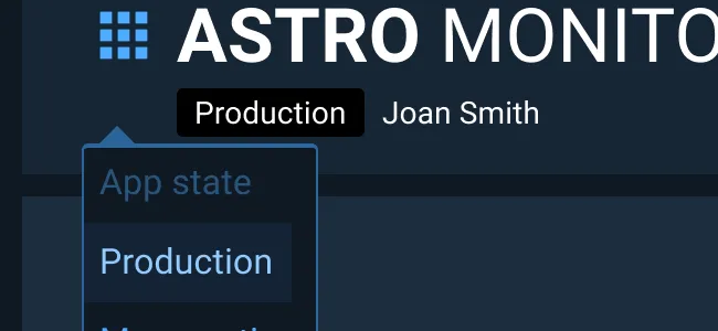
- If the user needs to swap between application states within the user interface, then provide that option in the application menu. This functionality should only be added if research has shown that easy access to other application states is beneficial to your users since the consequences of making changes in the wrong application state can often be quite large.
Appearance and Behavior
Background
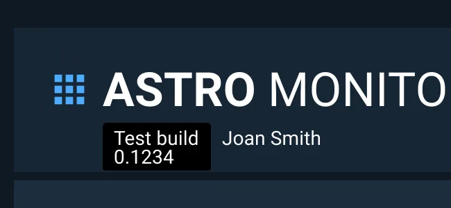
- The background rectangle does not change height, but will change width with longer text content.
- It is suggested that the background color for the application state component uses Astro 7.0 palettes Purple, Hot Orange, Pink, and Teal (commonly used for Tags).
Only use Tag colors when necessary as overuse of colors may reduce efficacy of monitoring icon, classification marking, and notification banner component colors.
Text
- Text within the component uses the Body 2 style and sentence casing.
-
The default font color is the Dark Theme’s default body text color (
--color-palette-neutral-000) for use with the default, dark background color. -
When a lighter Tag background color is used, the font color changes to
--color-palette-darkblue-950for better color contrast and legibility. - Text does not wrap within the component in order to keep the height of the Global Status Bar consistent across application states which improves muscle memory and faster recognition time.
Location
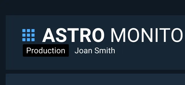
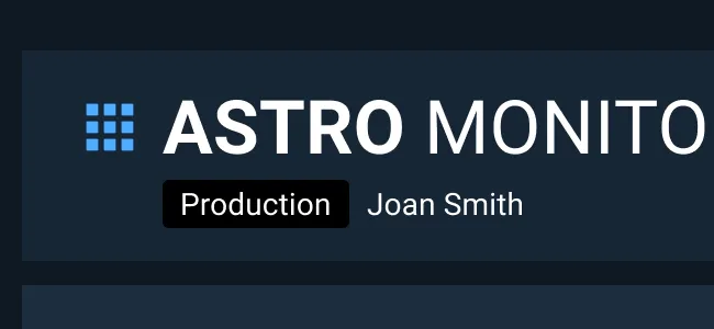
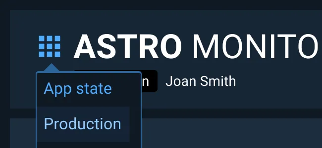
- The App State component is placed below the application title text in the Global Status Bar .
- The App State should be left-aligned to the application title text, not the menu.
- If a left-aligned username is present, add space between the App State and the username to ensure legibility of both elements.
- When the App State is present, the application title, menu, state, and username section should be vertically centered in the allotted space within the Global Status Bar .
Examples