Interactive Example
Rules of Thumb
- Use Checkboxes when there is a list of options from which the user may select any number of choices.
- In a list, each Checkbox is independent of all other Checkboxes.
- When asking the user to make a mutually exclusive choice, use a Radio Button not a Checkbox.
- Group Checkboxes whenever possible.
- When grouped without a parent Checkbox, provide a group label.
Appearance and Behavior
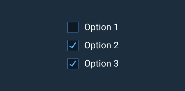
A basic Checkbox consists of a visual indicator of its selected state followed by a label. Individual Checkboxes can appear selected (checked), Unselected (no check), and Disabled (no action can be taken by the user). An Indeterminate state (a dash symbol rather than checked) may display when a Checkbox is used as a parent of a group of Checkboxes where at least one child is selected and at least one is not.
A Checkbox can be configured for required input. Help Text for individual Checkbox list items left-aligns with the item’s text and not its icon for easier text scanning. To learn more about adding Help Text or Validation to Checkboxes or Checkbox groups, see the Forms and Validation guidance.
Don’t use a Checkbox to initiate an action. Instead, use an Action Button or a Switch Button
Examples


Asset Status
| Asset | Version | Status |
|---|---|---|
| Documentation | N/A | Available |
| UI Kit - Dark | v7 | Available |
| UI Kit - Light | v7 | Available |
| UI Kit - Wireframe | v7 | Available |
| Web Component | v7 | Available |
| Component Tokens | N/A | Planned |