Astro’s user research, conducted on a wide variety of space applications, showed that inconsistent and unconstrained use of colors and symbols left users confused and even dismissive of color systems. The research further showed that wide overuse of red to indicate both “off” and “emergency” stripped the color of its attention-getting power.
The Astro Status System is a standard to consistently indicate the state of an object or concept (typically represented by an Icon). The Status System consists of Status Symbols and Status Colors.
The Status Color palette for the Status System is based on a color temperature scale. The lowest level of severity, Off, is grey (neutral) and the highest level of severity, Alert, is red (hot).
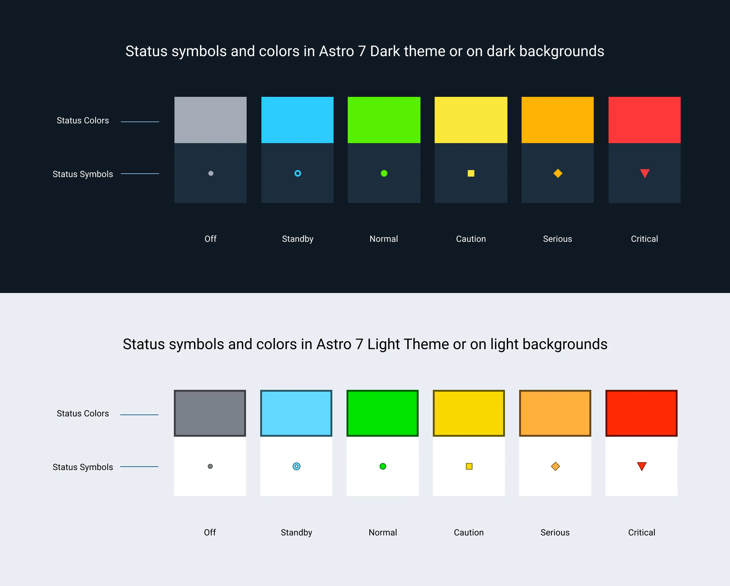
Each Status Symbol is a combination of a Status Color and a shape. The shapes are provided to ensure people with color blindness can also clearly identify the state of the object or concept
Rules of Thumb
- A state change must be reflected by a change in the Status Color and, if appropriate, the Status Icon.
- Only use the standard set of Status Symbols and Status Colors provided.
- Use the highest level of urgency status if multiple statuses are consolidated. For example, if the statuses of underlying components are green, yellow, and red, the consolidated indicator is red.
- Reserve red for states that are urgent and require immediate attention.
Status Colors
Status Colors on Dark Backgrounds
For the Astro UXDS Dark Theme, and on dark backgrounds, the following Status Color values should be used. A border is not necessary, as these colors pass WCAG AA contrast ratios on dark backgrounds.
| Values | Descriptions | |
|---|---|---|
| HEX: #FF3838 RGB: 255,56,56 Token: color-status-critical CSS: —color-status-critical | Critical, severe, alert, form error, emergency, urgent | |
| HEX: #FFB302 RGB: 255,179,2 Token: color-status-serious CSS: —color-status-serious | Serious, distress, error, needs attention | |
| HEX: #FCE83A RGB: 252,232,58 Token: color-status-caution CSS: —color-status-caution | Caution, warning, unstable, unsatisfactory, watch | |
| HEX: #56F000 RGB: 86,240,0 Token: color-status-normal CSS: —color-status-normal | Normal, on, ok, fine, go, satisfactory | |
| HEX: #2DCCFF RGB: 45,204,255 Token: color-status-standby CSS: —color-status-standby | Standby, available, enabled | |
| HEX: #A4ABB6 RGB: 164,171,182 Token: color-status-off CSS: —color-status-off | Off, unavailable, disabled |
Status Colors on Light Backgrounds
For the Astro UXDS Light Theme, and on light backgrounds, the following Status Color values should be used. When used, a darker border is necessary around the fill color, as the fill colors do not pass WCAG AA contrast ratios on light backgrounds. Those border colors have been specified here.
| Fill Values | Border Values | |
|---|---|---|
| HEX: #FF2A04 RGB: 255,42,4 Token: status-symbol-color-fill-critical CSS: —status-symbol-color-fill-critical | HEX: #661102 RGB: 102,17,2 Token: status-symbol-color-border-critical CSS: —status-symbol-color-border-critical | |
| HEX: #FFAF3D RGB: 255,175,61 Token: status-symbol-color-fill-serious CSS: —status-symbol-color-fill-serious | HEX: #664618 RGB: 102,70,24 Token: status-symbol-color-border-serious CSS: —status-symbol-color-border-serious | |
| HEX: #FAD800 RGB: 250,216,0 Token: status-symbol-color-fill-caution CSS: —status-symbol-color-fill-caution | HEX: #645600 RGB: 100,86,0 Token: status-symbol-color-border-caution CSS: —status-symbol-color-border-caution | |
| HEX: #00E200 RGB: 0,226,0 Token: status-symbol-color-fill-normal CSS: —status-symbol-color-fill-normal | HEX: #005A00 RGB: 0,90,0 Token: status-symbol-color-border-normal CSS: —status-symbol-color-border-normal | |
| HEX: #64D9FF RGB: 45,204,255 Token: status-symbol-color-fill-standby CSS: —status-symbol-color-fill-standby | HEX: #285766 RGB: 40,87,102 Token: status-symbol-color-border-standby CSS: —status-symbol-color-border-standby | |
| HEX: #7B8089 RGB: 123,128,137 Token: status-symbol-color-fill-off CSS: —status-symbol-color-fill-off | HEX: #3C3E42 RGB: 60,62,66 Token: status-symbol-color-border-off CSS: —status-symbol-color-border-off |
Avoid adding additional colors if possible. Creating additional colors greatly reduces the user’s ability to learn and properly use the application.
Asset Status
| Asset | Version | Status |
|---|---|---|
| Documentation | N/A | Available |
| UI Kit - Dark | v7 | Available |
| UI Kit - Light | v7 | Available |
| UI Kit - Wireframe | v7 | Available |
| Web Component | v7 | Available |
| Component Tokens | v1 | In Progress |